Quick links
To use images for an assignment, you need to find and choose—or create—the images.
What images convey your information and ideas? Where can you find images? How do you cite them? How do you create an image if you need to? All of these questions will be addressed in this web page.
In the meantime, we recommend starting at Purdue University Online Writing Lab (OWL) for an overview of the different kinds of images you can use and how those choices will impact the effectiveness of your communication. .
Finding images
Need some help finding an image? If so, stay away from clip art. Clip art looks cheesy and unprofessional. Instead, here are a few resources for finding free images:
- Search.Creative Commons: a website that allows you to search other websites for creative commons works.
- Unsplash: a website with thousands of free stock photos that don’t require citations.
- Pixabay: over 1.4 million free photos that don't require citations.
- “How to Use Google Images Without Copyright Issues”: A YouTube tutorial on avoiding copyright issues with Google Images.
Choosing images
A few principles:
- Decide where you need a image to convey information that’s necessary.
- If the images you create will be viewed from a distance (on a poster or projected on a screen), will the images be large and high quality enough to see from a distance?
- Are the images easy to look at? If there are too many colors, fonts, or too much brightness, then it’ll be straining to look at.
- Is the image simple? If too much explaining is needed or if the visual further complicates an idea, it probably shouldn’t be used.
(Principles adapted from "Visual Aids," a document about how to use visual aids in speeches by Calvin University communications professor Kathi Groenendyk.)
Crediting and fair use
Do you want to use an image that isn’t free or in public domain? Well, in most cases, if you cite your source and only use it for educational purposes, you should be fine!
However, you should be aware of a legal term called Fair Use. Fair Use is what allows you to use most copyrighted photos for your own educational purposes, though citations are required under fair use laws. Entertainment Lawyer Gordon P Firemark explains Fair Use.
If you want to be absolutely sure you are using the image legally, ask permission from the photographer or artist.
Resources related to citing an image, you’ll want to follow your particular style guide:
If no citation style has been recommended, be sure to cite as much information as is available, including the photographers’ or creators’ names, where you found the image, and the publication date.

The Pews at Westminster Presbyterian Church, Grand Rapids, Michigan. Photo by Joshua Polanski (2018).
This image, from a communication student here at Calvin, is an example of an extended image citation.
If you don’t want to worry about whether or not the way you’re using an image will be covered by fair use laws, then we recommend using images that are marked “Creative Commons.”
Choosing and creating tables, charts, and diagrams
When you need to report data efficiently, you’ll almost always want to use tables, charts, graphs, and diagrams.
These visuals have powerful potential. For example, using a diagram in the article “Molecular Structure of Nucleic Acids,” J.D. Watson & F.H.C. Crick, forever changed how humans understand molecules. The article contained no more than a few hundred words—and one detailed diagram.
Boston University School of Public Health: will help you choose between tables, charts, and graphs. We also recommend Calvin University—What Not To Do: Data Representation.
Tables
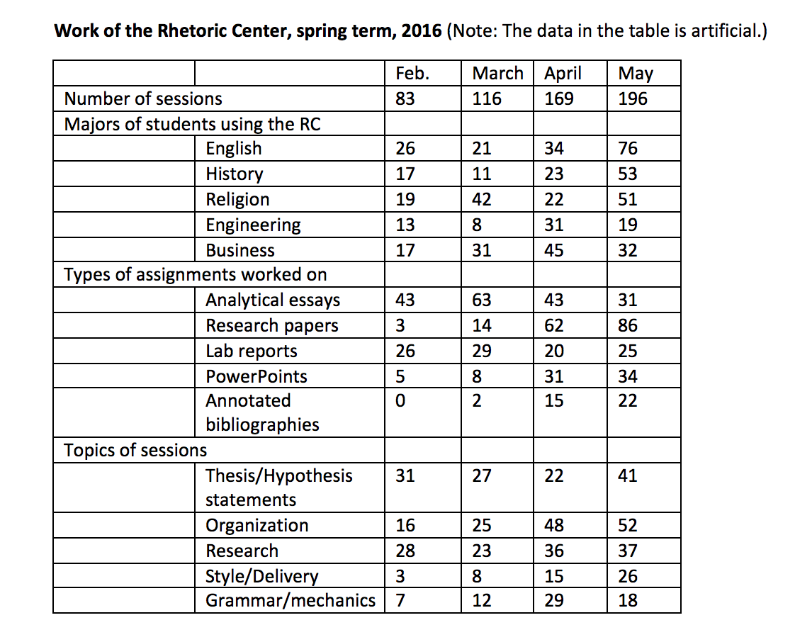
For every set of data and every purpose for collecting data, consider what is the best way to represent the data graphically. If you only want to trace the total number of sessions (because your purpose is to convince administration to hire more student consultants), a simple line graph would show the totals and trends really well.
But when you have a large number of categories, as in the sample table, a line graph would be too complex for your purposes (e.g., to plan staff training, to plan meetings with departments who send the most students, etc.). Imagine how much useful planning data the Rhetoric Center director can mine from a table like this (and the actual data tables that the Rhetoric Center keeps are far more complex than this). For a complex set of data and purposes, a table may be your best option.
Charts and graphs
Because they can create an easy-to-read visual story, charts and graphs are great helps to professionals who are reporting research data. Think of the simplicity and effectiveness of a line graph that shows a steady increase in your GPA during each semester at college. In one flash of vision the graph tells your story.
But you’ll have to choose among many graphic options: line graphs, bar charts, pie charts, etc. To help in thinking through these choices, survey the options that you’ll find in Microsoft Excel. Always select the option that conveys your data in the simplest, most readable ways. When in doubt, experiment. Desmos software lets you create different kinds of charts and graphs in minutes.
Diagrams
By ZooFari [CC BY-SA 3.0 (https://creativecommons.org/licenses/by-sa/3.0)], via Wikimedia Commons.
Sometimes, when you need to show how something looks and works, a diagram is your best option. Imagine that you’re an engineering major and you need to show how to connect some wiring in a machine you’ve designed. A photo of your wring would do a poor job of showing exact what wires go where. But a diagram could be your perfect answer, and Microsoft Excel is great for making diagrams.
Diagrams are best used when it’s too complicated to explain an idea or show an example using words alone. That’s what makes the green budgerigar (a type of bird) diagram a perfect example. It’s hard to communicate the intricate appearance of a specific bird without a picture. In addition, the diagram is more interesting and allows the viewers to see multiple labels at once.
Creating images
If you cannot find an existing image, create one. If you are not artistic or if the image is rather simple, Google Drawings is a great choice.
Other options:
- Canva: Canva is a collaborative graphic design tool website.
- Adobe Illustrator: this software is not free, but the Calvin University Mac computers have access to Illustrator; if you are on campus, this software will be helpful.