You’re composing an assignment that uses images and probably a combination of images and text. These visuals need to be placed—what we call arrangement. In addition to the general questions, you’ll need to answer this set of basic questions:
- How many “parts” will you include in the design?
- Where on the page or screen or three-dimensional space will you place each of the parts? (see “hierarchy”)
- How will you build connections among parts? (see “alignment”)
We’re calling these “arrangement” questions. Remember to answer them to maximize the effective and clear communication of your ideas.
Arrangement is vital to successful visual rhetoric. It guides the eyes and tells the viewer where to look. Knowing how to guide a viewer’s eyes throughout the images on a page or screen can make or break a design.
If you aren't convinced in the power of visual arrangement, watch this critical analysis of Diego Velázquez’s Las Meninas. It speaks for itself.
Organization
Organization (aka, “layout”) is critical to the success of visual rhetoric. Without thoughtful organization, the viewer will not know where to look and get confused, the creator of the visual will lose credibility (or ethos), and the overall message will get blurred.
We break down organization into three subcategories: hierarchy, alignment, and proximity.
Hierarchy
Hierarchy is the control of visual elements to communicate importance. When viewers look at a screen or page or poster, they’ll perceive the elements in a particular order. This order is dictated by the principles of hierarchy.
Why should I care about my use of visual hierarchy?
- If used effectively, it can make a complex message simple!
- Hierarchy guides the viewer in where to look and in what order. If you have a visual element that is absolutely critical to your visual’s success, draw attention to that visual element through the use of hierarchy.
How can I use hierarchy to communicate clearly?
- There isn’t just a single way that hierarchy can be used. There is a main concept, though: you need to plan your use of hierarchy.
- Freelance graphic designer, Gareth David, composed a list of some basic hierarchical structures. Here are a few important ones:
- Hierarchy in scale: make important visual elements larger than less-important elements.
- Hierarchy of placement: Put vital information on top and unnecessary information on the bottom.
- Hierarchical in color: make important elements distinct through the use of color contrast. (See contrast.)
If you would like to watch designer Gareth David explain his multiple template options, check out his video (3:12-6:13).
Remember, you don’t need to use every single method of hierarchy. In fact, using every method would be counterproductive. Just make sure to visually direct the viewer where to look.
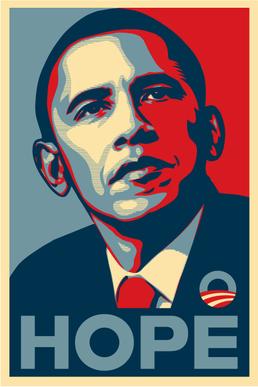
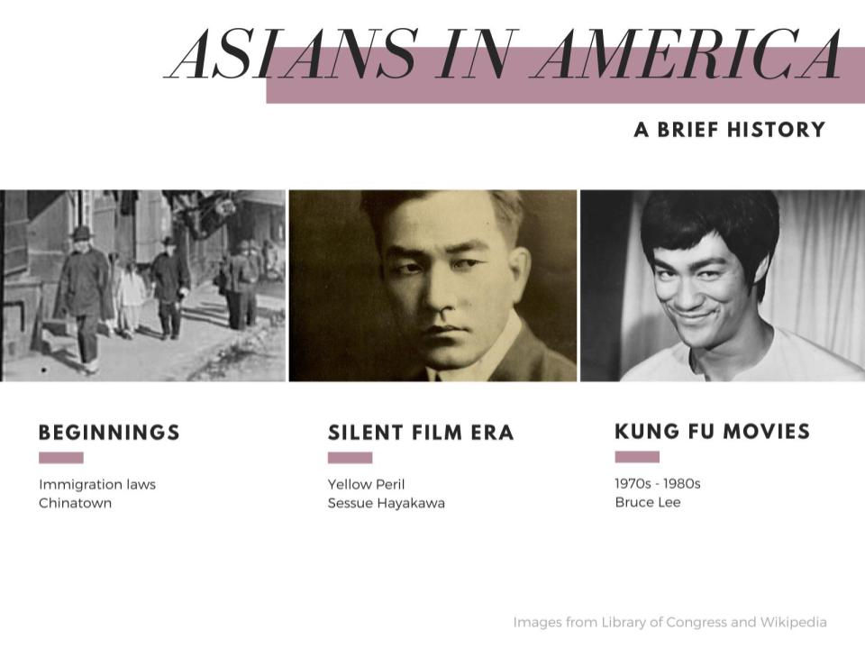
Look at two examples of hierarchy. The first, an examination of a political poster; the second, a PowerPoint relating to film.
Other general hierarchical principles to contemplate
- Take advantage of how we read left to right, top to bottom. It’s less effective to put important visual elements on the right than on the left because of the way we read.
- Don’t just think about what works; think about what doesn’t work. Is there too little contrast? Does nothing seem more important because there is too much information being emphasized by being placed at the top?
Have multiple layers of emphasis, like a magazine cover.

Photo by Christopher Desrocher, Airman magazine, U.S. Air Force graphic.
- Magazine covers, like this issue of Airman, tend to be excellent examples of using hierarchy to guide the eyes of the viewers. Most viewers probably first look at the shadowed out men. This is because the men are large, with dark contrast, while being towards the center of the cover.
- After looking at the men, the title Airman behind them is the next noticeable visual element. We probably notice this second because it’s behind the men and the men even cover part of the title. It‘s important for the title to be one of the first elements that is noticed because, well, it’s important to the company who makes the magazine; if their readers don’t care for the Airman title they probably won’t buy the next issue. We notice it before the rest of the magazine cover because it is large and placed at the top of the page.
- Next we notice the words at the bottom of the page—because they’re on the bottom and are smaller than the other two main visual elements (the men and the magazine title).
- In conclusion: this multi-layering system simplifies the cover and tells us what is important and in what order. If the words on the bottom were emphasized most, and then the title, and then the picture of the men, the cover could be confusing, dull, and no one would buy it.
Alignment
Alignment is the placement of visual elements so they line up in an intentionally thoughtful way. Each visual element should be lined up, in some way or another, with another visual element.
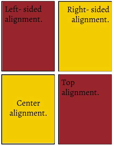
The images you see demonstrate that visual elements can be aligned multiple ways: on the side edges (left or right), top or bottom, or in the center.
Read LifeWire for a more specific breakdown on these different kinds of alignments. Feel free to skip over the “common problems” section. The article breaks down the different types of alignments. The article primarily uses text alignment; but the same principles can apply to other visual elements.
If unaligned, visual rhetoric can appear unprofessional, thoughtless, and confusing. These undesirable qualities take away from the ethos of the presenter and their visual work. Careful alignment can make a design appear professional, thoughtful, and guide the viewer. Proper alignment supplies a sense of structure, of purposeful arrangement.
How does one align multiple visuals?
Grids can help. Software programs such as InDesign, Illustrator, and Photoshop come with a grid system that can be turned on or off.
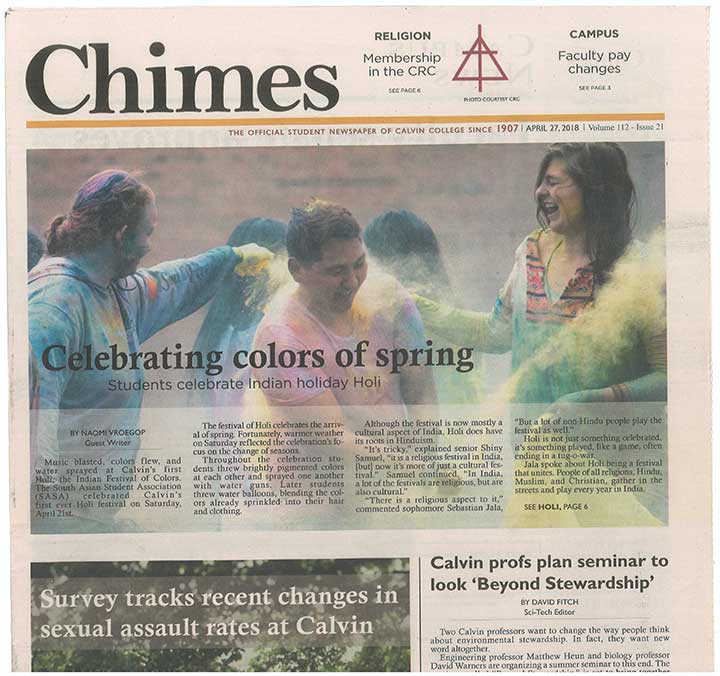
Thoughtful and professional alignment can easily be seen in any issue of Chimes.
Consider aligning multiple visual elements when designing posters and PowerPoints.
If un-aligned, the visual appears chaotic, unprofessional, and the viewer won’t know where to look.
Resources related to alignment
- Printwand: an in depth analysis of multiple ways alignment can be used. It also goes over “flushed alignments,” which we didn’t cover.
- Gareth David, freelance designer: If you’re still confused about the principle of alignment, check out this video. Watch from 1:34 to 6:03.
Proximity
Proximity is the grouping and shaping of multiple visual elements.
The visual elements can be body text, title text, images, graphs, etc. The space between various items helps establish the relationships of those various items. If two items are closer together, we assume they’re related; if two items are farther apart, we assume less relationship.
Captions utilize proximity. If a caption were placed far from the figure, the viewer would be confused. Therefore, we put captions in close proximity to the figure to infer a close relationship.
If captions are badly placed, viewers become confused about the relationship between caption and corresponding image. Our example shows the same graphic twice: the first with badly placed captions and the second with properly placed captions.
In addition to inferring an intellectual relationship between various visual elements, proximity impacts the credibility of the creator. Poor proximity births unprofessional design aesthetics.
It also makes a viewer confused about what to look at first and how to figure out which elements go with one another.
White space is closely related to proximity. White space is space without visual material. It helps improve the readability of text and allows the viewer to breathe when absorbing visuals. If you think that effective use of white space is something you need to improve on, check out our section on white balance towards the bottom of the "Contrast " section.
There are multiple reasons someone could create visuals with poor proximity. Perhaps they simply never thought proximity was important. More likely, they’re trying to avoid white space so they fill the page with their visuals. This is unnecessary: white space is okay. No need to shy away—It doesn’t bite.
If whitespace is neglected, you could end up like our next example.
So, when you design a visual, ask yourself: what message does the proximity of your visual elements suggest?
Consistency
In visually aided speeches and presentations, the images are meant to communicate what can’t be well-communicated orally. Therefore, they’re meant to supplement, not distract. When multiple visuals are used, inconsistency amongst them can distract the audience.
How exactly does one maintain consistency?
There are actually multiple approaches, but the key is to ensure the viewers understand a sense of continuity among the images.
- Headers: if you use them once, keep using them.
- Color palette: stick with the same color palette. If your first PowerPoint slide uses purple and yellow, continue to use purple and yellow. It would distract the audience if the next slide uses blue and orange.
- Font choices: be consistent. If the first section of the poster uses the Garamond font, the next section should too.
- Arrangement: if the poster is arranged into rectangular boxes with pictures and words inside of the boxes, it could distract the audience if some of the boxes put the image to the left of the words while the rest put their image to the right of the words.
You’re in an advertising class and you have to present a campaign for an event hosted by a Christian organization. You choose Winter Jam 2018 and create this Google Slides presentation.
You carefully considered the consistency of the presentation. How can we tell? Well first, the color scheme is consistent. The same blue, pink, and yellowish orange are used throughout. And second, the background is the same image. This gives the presentation a sense of united themes and clear consistency.
General notes
You don’t need to find an exact template, copy and paste each slide, and completely fit into the template; sometimes an image will be too long to be stretched into your typical image length, or a variety of other things can happen. Just ensure you have multiple methods to achieve overall consistency even if particular elements, such as image alignment, change from slide to slide.
Even though our examples are both from slideshow presentations, the principles are applicable to other assignments. When you design a poster, use a consistent color scheme and alignment. In videos, consistency can be as simple as having a similar background for different speakers. You can apply the principle of consistency no matter the assignment!
Contrast
Contrast is created by combining visual elements that differ from one another.
Contrast is difficult to master because it requires a base understanding of all the other visual rhetorical principles we’ve covered (color, typography, etc.). However, contrast is foundational because surprises are more noticeable than a typical formula. Remember the principles of each visual technique when creating contrast. If you’re trying to create contrast using color, keep color principles in mind.
Don’t use a color just because it’s different; instead, consider color schemes. If you’re trying to create contrast using fonts, keep in mind the principles of using fonts.
Contrast is used to differentiate elements, draw attention to elements, and to create a focal point for a visual.
Contrast and hierarchy cooperate to create an order for the eye to follow. Thus, you should consider hierarchy at this point too.
This article by Matthew Encina, a designer for XBOX and Coldplay, demonstrates how different contrasting elements can be combined into a single design. Pay particular attention to why Encina’s examples work. For example, as Encina specifies, the final image of the wolf stalking the deer utilizes both size and value contrast to make the wolf appear predatory.
Contrasting size
The contrast created by making certain visual elements larger or smaller than others draws attention and emphasizes visual elements.
Large elements tend to draw our attention before smaller elements, creating hierarchy and a sense of organization. For example, in this graphic for an imaginary book sale, the “Book Sale” grabs our attention because of the extreme font size. A viewer goes on to read the details because their attention has already been grabbed by “Book Sale.”

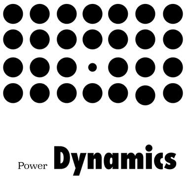
Size contrast usually means making certain elements larger; however, the reverse also works: if all elements are of a certain size and only one is smaller, then attention will be drawn to the smaller element. This is particularly helpful when highlighting power dynamics, such as this image created on Adobe Illustrator. In the image, the eye is first drawn to the small circle because it’s the only different circle.
Contrasting colors
Color contrast is the use of differing colors to highlight or balance different aspects of a visual—and make a piece more visually appealing.
We recommend checking out our “color schemes” page. It’s useful when learning how colors work well together and how to create a working color palette. In the meantime, we reiterate some general advice:
- Light and dark colors tend to compliment each other and make for a pleasing visual contrast.
- The amount of a color used is important to its aesthetic. If you have a mostly grey and dull baby blue visual piece and you add a splotch of scarlet, the scarlet will certainly stand out.
- The placement of the colors is also important. If the page starts light and gets progressively darker towards the bottom, this tells the viewer to give a greater amount of attention to the top.
- Bright colors with other bright colors can be tiring.
- Dull colors on other dull colors can be hard to read.
- Work with complimentary colors that don’t strain eyes.
Contrasting typography
We discuss which typefaces work well together on the Text in Visuals page, but the most important advice when contrasting typefaces is: go big or go home. If you’re using multiple fonts, use fonts that are drastically different from each other. This provides visual contrast that makes the visual more appealing and makes the text more legible. Often, graphic designers use serif or script titles with sans serif bodies.
Generally, using multiple fonts in body text causes confusion.
Contrasting whitespace
White space is one of the two types of spaces used in graphic design. It refers to the use of empty space (or negative space) rather than space taken up by visual elements (positive space). In other words, it’s the space without any visual elements. And contrary to the name, it doesn’t have to be white!
Why should I care?
White space can give your work breathing space, which allows the viewers to relax. In addition, whitespace guides the eyes of viewers by calling attention to positive space.
This Canva article is a great guide to using white space and how to use it to direct the eyes of the viewer. We recommend the eight points under the subtitle “How to design with whitespace.”
Are you in a rush? Here are a few of the points from the article:
- Intentionally leave spaces empty.
- Use a colored background.
- Don’t use borders on the outside.
- Overemphasize one aspect of your visual design.
For further direction, come to the Rhetoric Center!