As you know from your own experience, color catches your attention and influences your responses to images. Color communicates ideas and emotions.
For a concise guide on the fundamentals of color use within visual rhetoric, we recommend the Purdue University Online Writing Lab (OWL).
General color use
Color theory is the natural starting point for thinking about choosing colors. Color theory, as you may already know, is based on the three primary colors (yellow, blue, and red) and the colors they create when mixed. And you probably learned basics of color theory by looking at a color wheel.
The colors directly across from each color on the color wheel are called complementary colors. Red and green complement each other, as do purple and yellow. They’re called complementary colors because, well, they complement each other; they please the eye. However, when choosing a color scheme, there are multiple options.
A color scheme is a palette of colors that one uses to create an image or visual aid. Here are five color schemes:
- Monochromatic: a color scheme based on a single color that uses different shades of that color.
- Analogous: colors next to each other on the color wheel.
- Complementary: any two colors directly across from each other on the color wheel.
- Split complementary: a slight change up from the complementary color scheme; instead of it being the color directly across from the one you intend to use, the other colors are the two that surround that complementary color.
- Triadic: any three colors that are an equal distance away from each other on the color wheel.
If you’re still confused about color theory and schemes, watch this video (from minute 2:12 to 8:10). For further direction, stop in at the Rhetoric Center to schedule an appointment.
More advice relating to color theory
- Just because a scheme uses two colors doesn’t mean the colors need to be used 50/50. In fact, usually they shouldn’t be. A little vibrant red with a majority somber green is more pleasing on the eyes than a 50/50 of red and green.
- Use colors in a way that isn’t tiresome. For example, too much bright pink or neon is exhausting. Remember: dark colors are easier on the eyes.
- Too much color can distract.
- Use the combination that is appropriate with cultural associations and audience expectations, not just the combination that looks the most attractive.
- The contrast between colors is just as important as the colors you choose. Red will stand out on grey because because of the contrast, but will stand out less when put next to a blazing blue contrast is reduced.
- Color can emphasize important points.
Generally, just remember that color communicates meaning.
Saturation and brightness
Saturation refers to the relative purity of a color. Like brightness, a specific color has a wide range of saturation. A barely saturated color is dull and grayish, like a dead blue-green or boring purple. A heavily saturated color is bright and intense, like a neon-green or bright red.
Ask yourself: would a dull or saturated color scheme work better for this particular assignment?
Brightness varies with a single color. Blue can be anything from a deep and dark blue to a light baby blue. The value should be considered when choosing a color because not all blues, reds, or oranges are the same.
Your own experience of colors will give you the most relevant examples of their potential to carry visual meaning. We all know that blues are cool, reds are hot, and reddish-browns are cozy.
Associations
The ways colors are used can create associations. Dark blue is often associated with sadness, yellow with happy, green with the outdoors, and purple is often associated with royalty.
Companies often use these associations to their advantage when designing logos.
By Terence Ong, (GFDL, CC-BY-SA-3.0) from Wikimedia Commons.
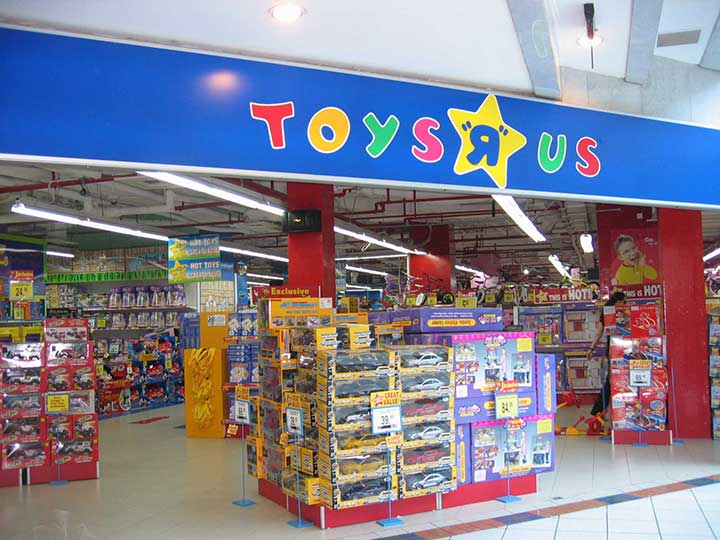
For example, because bright and multicolored tends to mean fun and energetic, Toys“R”Us (R.I.P.) took advantage of this with their logo. This reflects their audience: children, who tend to want toys that are fun and energetic, like themselves.
While Toys“R”Us uses colors to create a playful look, companies like Apple use color differently. Black and white logos, such as the Apple logo, communicate a serious and sophisticated tone. This reflects Apple’s goal: to sell serious technological products; people tend to want technology that seems serious and sophisticated.

By Original: Rob Janoff [Public domain or Public domain], via Wikimedia Commons.
It’s important to remember that just because a color can have emotional associations, doesn’t mean that the association is present every time we see that color. For example, red is associated with both violence and love.
The brightness, hue, and particular situation influence the associations that a color will have in any specific scenario.
Color combinations can also have emotional and cultural associations that individual colors don’t maintain. Red and green is often associated with Christmas, and brown and orange is often associated with Halloween.Read points 1-3, , which go over differing ways colors affect us through associations, from “How Colour Communicates Meaning.”
Does the way you're using a color have any associations? If so, are they associations desirable for the assignment or are they unrelated?
If you find yourself asking “what does this color mean,” this blog will help you start. Pick which color (or combination) you’re considering and the blog will break it down, giving you a brief analysis of the psychological associations people may have with that color.
We can’t possibly cover every color association in this short overview. Our goal is simply to get you thinking about the ways you’re using colors.
For further direction on the use of color in an individual assignment, we recommend you visit the Rhetoric Center.
Audience expectations
An audience usually expects to see certain colors. Next year, Christmas decorations will likely remain green and red; try to imagine the oddity of an olive gray and lavender wreath.

At a professional poster presentation, why is this poster likely to be taken seriously by a professional audience?
This poster is likely to be taken seriously by a professional audience because it uses a consistent, professional color scheme: not too bright or distracting, and the green attracts your attention.
Similarly, most academic settings don’t expect to be shocked by colors, such as a domination neon-pink in a poster presentation. Color choices affect your ethos: will your color help your audience to take you seriously?
In a presentation, if visuals are used that have words on them, the background and color of the font need to be chosen so that people can easily read the words against your color background.
If a presentation involves technology, don’t assume your audience can read it just because you can on your laptop. The image may be harder to see or read when blown up or viewed from a distance. Similarly, it’s wise to have a backup; technology isn’t always reliable.
Consider your audience and their expectations; if you give them something scandalously different than they expect, odds are they’ll end up confused and distracted from your intended meaning.
Want to explore color some more?
Resources related to color:
- Wonder Woman: A fun video about how the film Wonder Woman uses color to evoke particular feelings. This video is helpful in learning how to analyze how other people use color in their own visual rhetoric. In other words, this resource looks at how color affects you.
- Meanings: A link about the specific meanings of different warm and cool colors.
- Scheme: A simple color scheme generator.
- The Rhetoric Center!